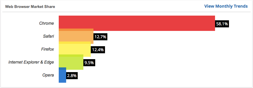
This post explains how to display links as buttons as shown in the image below. The webpage itself is from a course on Responsive Web Design by Jonas Schmedtmann that you can read about at www.webdesigncourse.co.

The HTML below highlights the links that will be styled as buttons.
<header>
    <nav>
       <div class="row">
             <img src="resources/img/logo-white.png" alt="Omnifood Logo" class="logo">
             <ul class="main-nav">
                  <li><a href="#">Food delivery</a></li>
                  <li><a href="#">How it works</a></li>
                  <li><a href="#">Our cities</a></li>
                  <li><a href="#">Sign up</a></li>
              </ul>
       </div>
     </nav>
     <div class="hero-text-box">
         <h1>Goodbye junk food.<br/>Hello super healthy meals.</h1>
         <a class="btn btn-full" href="#">I'm hungry</a>
         <a class="btn btn-ghost" href="#">Show me more</a>
      </div>
</header>
Below are the relevant CSS rule sets. Some points to highlights:
- The horizontal layout is achieved with the display and padding properties in the first rule set. The spacing between buttons is controlled through the margin-right property in the third rule set.
- The rounded sides are achieved with the border-radius property in the first rule set.
- The transition between the normal state and hoover/active has a transition effect for background-color, border, and color. The rule sets that correspond to the hover and active states modify the properties mentioned in the transition.
.btn:link, .btn:visited{
    display: inline-block;
    padding: 10px 30px;
    font-weight: 300;
    text-decoration: none;
    border-radius: 200px;
    transition: background-color 0.2s, border 0.2s, color 0.2s;
}


.btn:hover, .btn:active{
    background-color: #cf6d17;
}


.btn-full:link, .btn-full:visited{
    background-color: #e67e22;
    border: 1px solid #e67e22;
    color: #fff;
    margin-right: 15px;
}

.btn-full:hover, .btn-full:active{
    background-color: #cf6d17;
    border: 1px solid #e67e22;
    color: #fff;
}


.btn-ghost:link, .btn-ghost:visited{
    color: #e67e22;
    border: 1px solid #e67e22;
}


.btn-ghost:hover, .btn-ghost:active{
    color: #fff;
    border: 1px solid #cf6d17;
}
Links: